

 Reply With Quote
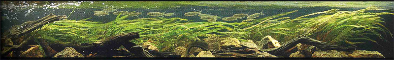
#11 looks like a river biotope... and the fishes looks exhausted :P


ADA 2005 11th to 20th places. These pic are from Akwarium site
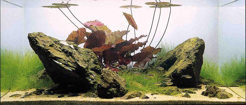
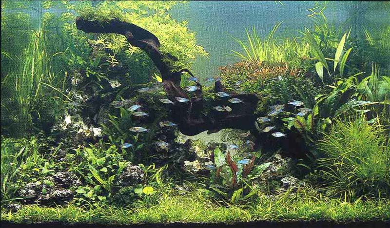
11
12
13
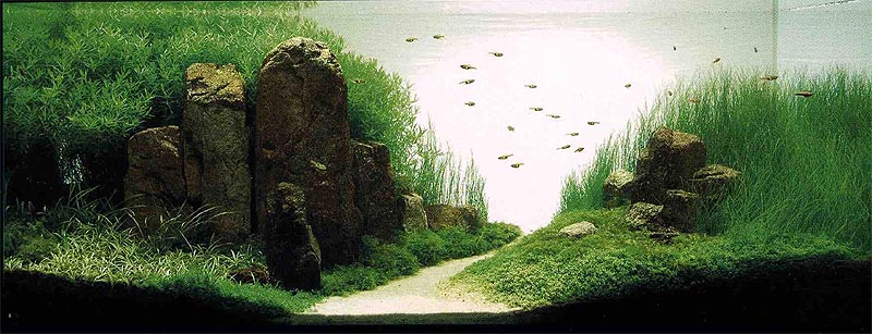
14
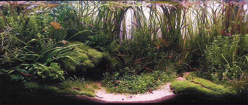
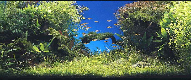
15
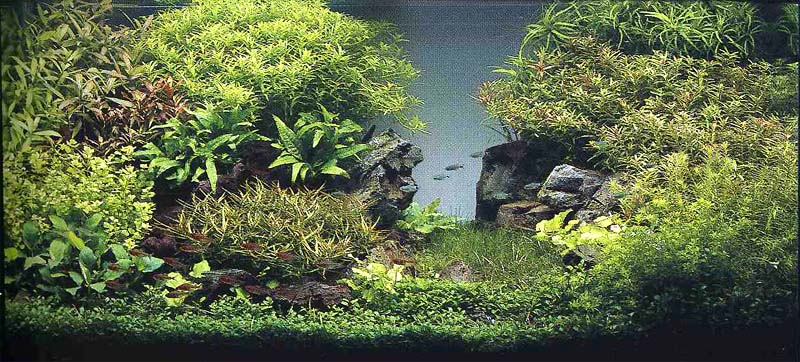
16
17
18
19
20

#11 looks like a river biotope... and the fishes looks exhausted :P
 I wan to automate my tank!

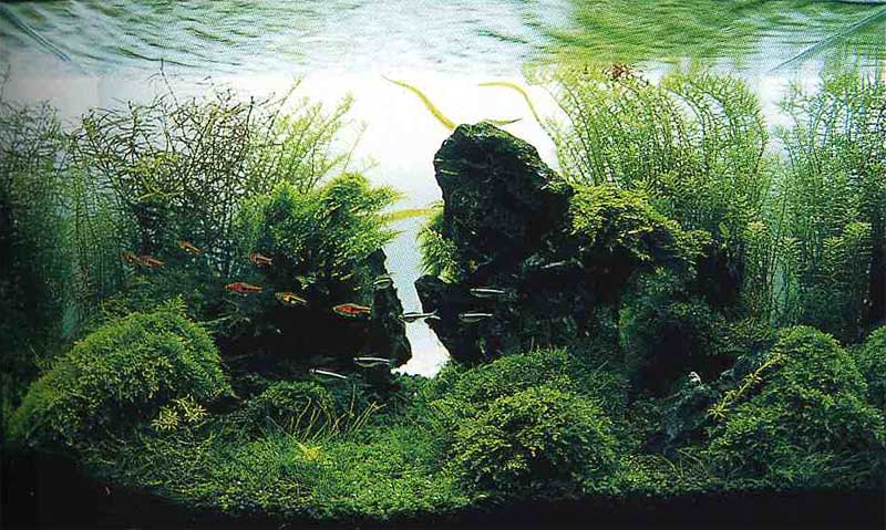
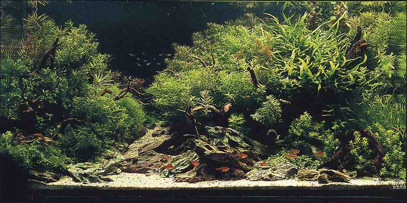
I love 13. Give me a mysterious feel.
JC
IMO these tanks are just as good as the top ten
The standard is there man... it's really impressive.
Even the 20th to 30th places were good to me! I like 18th.
The juggling apprentice fish


I like 13, 15 and 16.15 gives me a sense of serenity...
Read me! :bigsmile: http://justikanz.blogspot.com/
I'm crypt collecting... Starting cheap, now have Cryptocoryne beckettii, C.beckettii var petchii, C.crispatula var.balansae, C.griffithii(Melted!), C.nurii, C.parva, C.pygmaea(Melted!
Oh, juggling is hard work, man!...
I've more leaves in my tank!
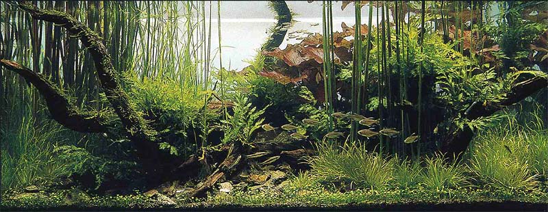
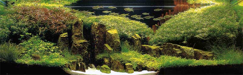
I like #20. looks like 2 cliffs.
FYI The 16th tank is by the same Korean Guy whose's tank won the Grand prize in ADA 2004
I like this better than his 2004 entry shown below.
i think rank no. 12 and 15 seem out of place. the rest are okay.
for 12, the stem at the back look very thin, unless of course it was his intention.
for 15, i would think the rock arrangment was good, but the lotus, hmmm, is really an acquired taste
I think 15 spaced his rocks a little too far apart, and I feel he should have grown hairgrass behind the lotus as well. Any comments?
Yippie!! Reptiles and Fishies!

i dont know what it is about 15.. it just irks me.. doesn't make me feel serene at all when i look at the tank.. its like splinter in the skine you can't tell where and everytime you touch it, it jolts you.. 15 does that to me.. i look at it and i cringe...so personally i dont like it.
favourites are 13, the probably 14 and then 16.
16 is a little artificial i feel.. but still nice..
The juggling apprentice fish
Haha...Looks like I am the only one who likes 15... Haha...
Ya, agree 16 looks a little artificial... a little wierd, in fact, but the effect looks good lor...
Read me! :bigsmile: http://justikanz.blogspot.com/
I'm crypt collecting... Starting cheap, now have Cryptocoryne beckettii, C.beckettii var petchii, C.crispatula var.balansae, C.griffithii(Melted!
Oh, juggling is hard work, man!...
I like 16.
IMHO I think for 15 the lotus doesn't blench with the zen concept.
BTW where to get those "straight" looking rock locally?
I vote for 16 for his ability to create a sense of depth. It's only a 3x1.5x1.5 tank, if I remember correctly.
koah fong
Juggler's tanks
I should be working not posting


ok since everybody is having a go,
11. i like this tank. it is very interesting and reminds me of balansae in thai rivers. if only tank was taller and not planted so evenly. some empty spaces would be good...
12 nice and bold rocks, created a lot of contrast. could do better with better selection of bg plants. the busy looking stems disturb serenity/flow. i'd replace it with green balansae or some tall aponogetons...
13 is my favourite here but it has so few visible fish.
14 is very nice but the verticals in the middle makes layout look static. looks original.
15 nice simple layout. could do better if the floating leaves were trimmed. better still if rubra was use instead of the tiger lotus. very difficult to create simple layout that make somebody look twice. japanese and african are very hard to match.
16 is very pleasing to the eye but would be nicer if the hg be combed to give a wilder 'tin tin' do. and way too few fish. add another 100 would do wonders.
17 needs some photoshop to take out the ugly magenta tint. a bit busy and probably last on my list.
18 is very nicely laid out but is a very heavy front right. ...photography wise i'd give it a stronger backlight to reveal the shape of layout to give the individual bunches separation aka depth.
19 has nice balance of fish but the plants are in odd places with too many types. the d/wood is overpowering. i imagine in my mind it will look better without it.
20 the fish position is perfect. the little bridge in the middle is nice but the strong blue bg makes it less natural. could be bolder with another piece of gnarly wood in 1/3 area right side mid ground where the rocks are.
IMHO the layout is too centred and choice of plants clash in terms of leaf size shape and scale in some places. i think if the right side is cropped the layout will be better, no? light coloured plants IMO look better closer to middle framed by darker plants.

You can if you dare to fail - Stan Chung
 Posting Permissions
Bookmarks